Year
2018
Areas
- Tourism
- Accomodation
Assets
- Logo
- Brand Materials
- Design
Art Senses, a new development in the tourism market.
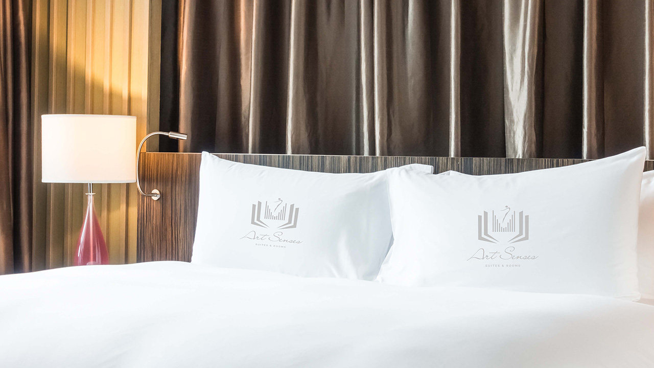
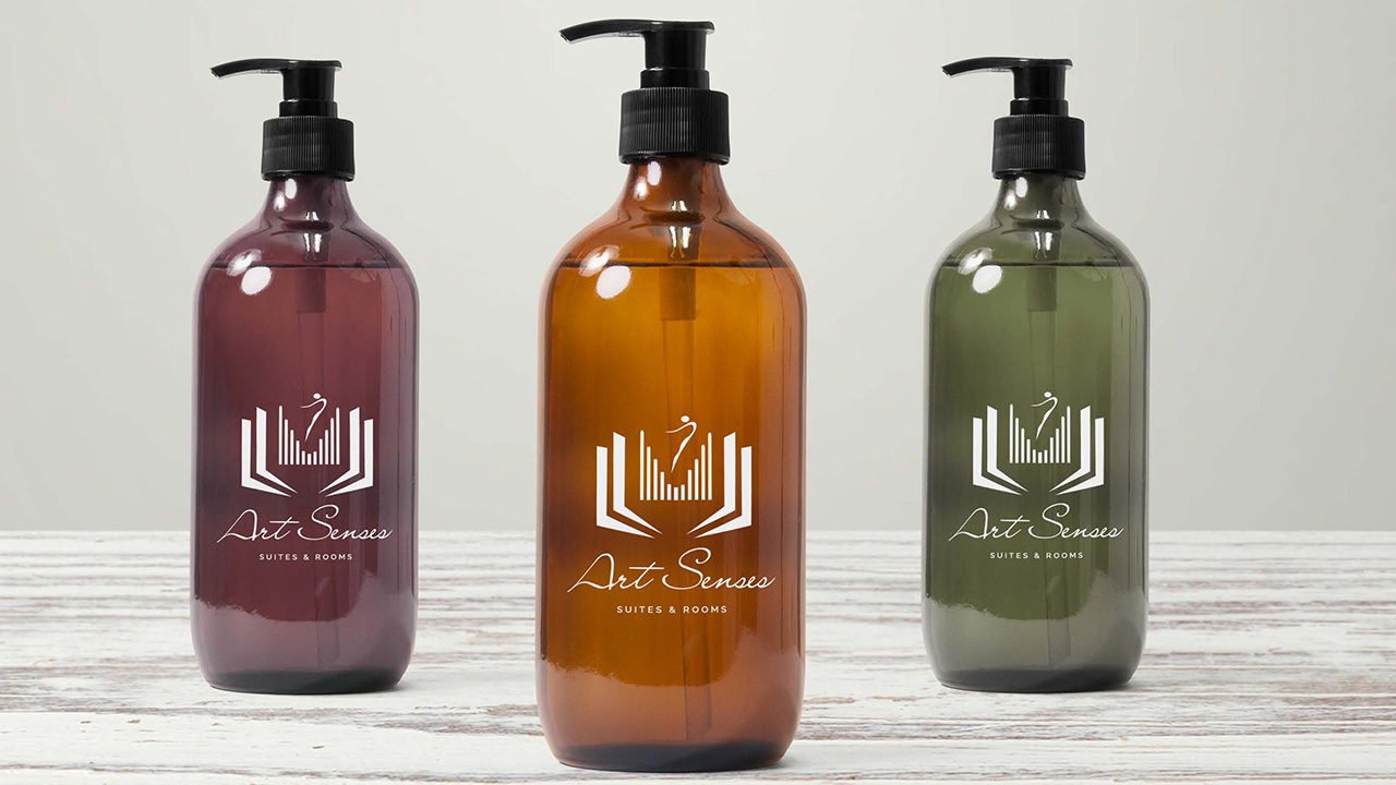
Art Senses, Suites & Rooms, is a newly developed premier Bed & Breakfast facility in the centre of Porto. They wanted to construct a brand identity that reflected their values, mainly the artistic side of each and every room, as well as the elegance of the complex.
Colours & Materials
A combination of iron grey, that contrasts with the pure white in the background, or in the alternative version, a subtle use of royal grey, a dash of purple mixed in with the former iron grey, for the background, and pure white for the logo. The symbol itself is a play on dance, music and literature, three of the main themes present at Art Senses.
Iron Grey
#616163
Royal Grey
#726f72
Pure White
#ffffff


