Oporto Near
Year
2017
Areas
- Tourism
- Accomodation
Assets
- Logo
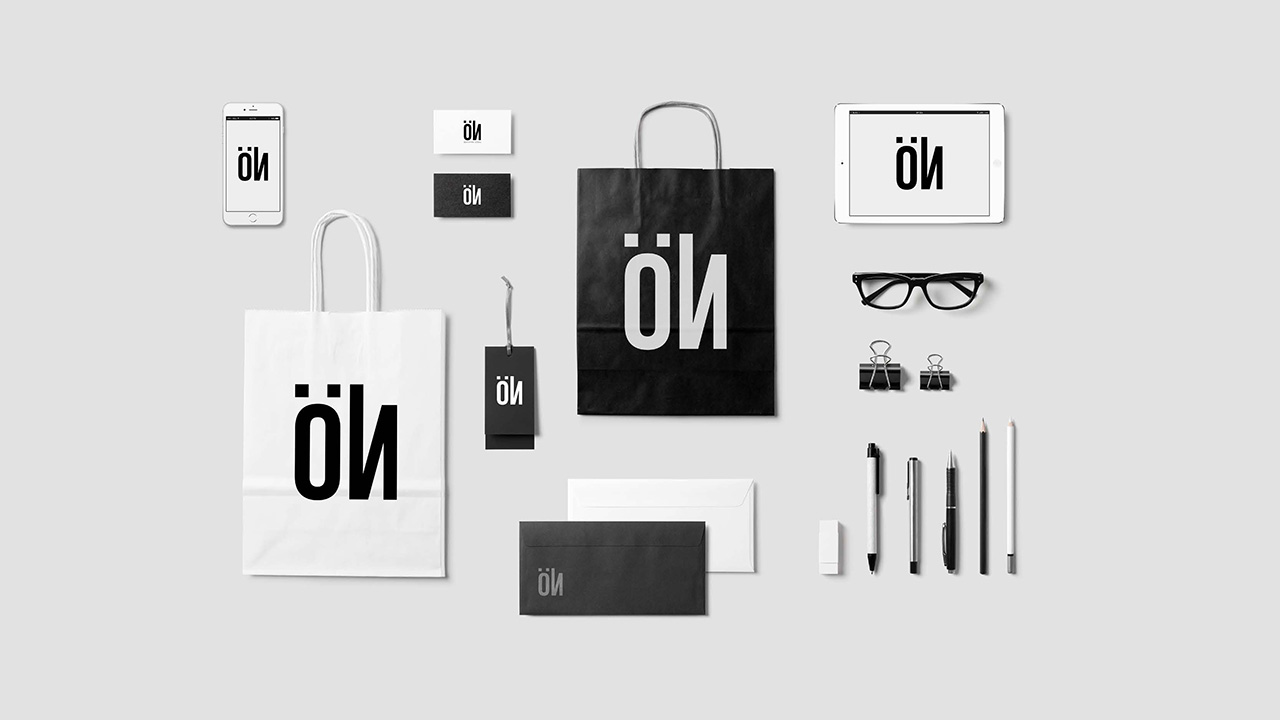
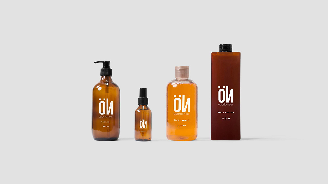
- Brand Materials
- Design
Oporto Near, a gorgeous and elegant set of apartments in the centre of Porto.
Oporto Near Apartments, wanted a logo that would illustrate their beautiful apartments, their exceptional decoration, and their luxury feel. Yet, the goal was to maintain a youthful spirit, that would attract customers of all ages and backgrounds.
Colours & Materials
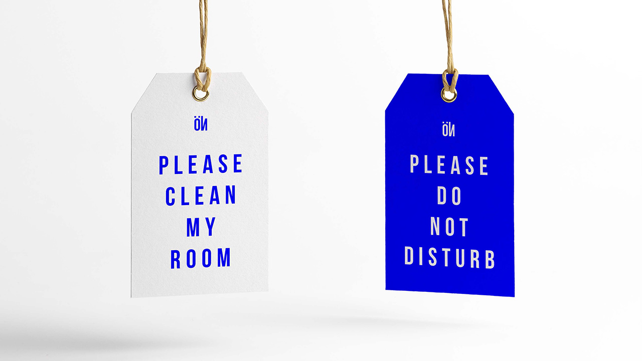
This apparently simple colour scheme, has the royal blue as its distinctive element, constrasted with the pure white, that highlights the natural vivid colour of the logo, the idea was to bolster the energetic feel of the design with a bold colour choice.
Royal Blue
#0000fe
Pure White
#ffffff


